Our Mission
What is income inequality in America and why should it matter to you? Our goal is to help you understand what income inequality looks like and to identify the many components that make up what it takes to live and to thrive in the United States today.
To do so, we've compiled data and developed visualizations from many different aspects of income inequality in order to establish a storyline of what it looks like today and how you fit into the overall picture. A key component of this picture is the notion of a living wage. To highlight this, we've developed the interactive MIDS Living Wage Explorer which allows you to view today's living wage at a county level, comparing different locations and different versions of a "living wage model". Above all, we hope that you view this tool as an advocate for exploration and education. Income inequality is a serious issue in the United States and it is our hope that this tool will lay the foundation for understanding what you can do to help resolve it for future generations.
Visualize Income Inequality
We often hear in the media that there is an ever-growing gap between the wealthy and the poor, but what does that look like and where do you fit? If we look at the evolution of mean household income over the last 50 years, we start to see a significant divide between the top 20% percent of Americans, with respect to the remaining 80%.
For example, let's take a look at a representation of mean household income evolution over the past half-century. Start by considering your current household income and identifying approximately where that places you in the chart today. Is that where you'd expect to fall in the household income spectrum for Americans today? Then, observe the spread between each grouping of Americans and how that spread has become more and more pronounced over time. Why do you think this might have been happening?
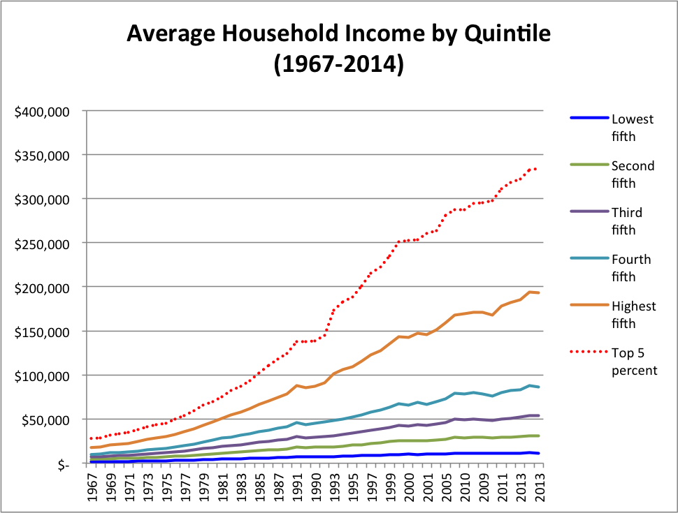 Figure 1: Mean Household Income Growth, U.S. Census Bureau
To summarize the information above, the increase in mean household income for the top 20% of Americans over the past half-century (~$175 million) is greater than the increase experienced by the remaining 80% of Americans combined (~$135 million)! One way to interpret this is that the purchasing power of the top 20% of Americans is increasing at a outlandishly higher rate than the entire lower 80% of Americans.
We can also look at mean household income from the perspective of growth percentages, year over year. In other words, for each quintile of American households, what was the annual growth in mean household income, expressed as a percentage of the prior year's mean amount?
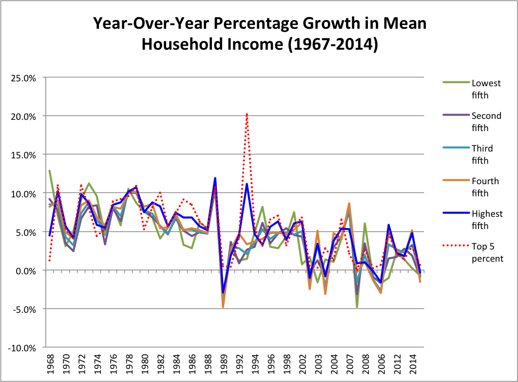 Figure 2: Year-over-Year Precentage Trends in Mean Household Income by Quantile, U.S. Census Bureau
Notice in the above chart that the general growth rates for all 6 groupings of the population stay approximately in line with one another. There are a few exceptions, of course, in 1989 and 1993. These shocks are largely the result of the recession beginning in 1989 (stemming from the Savings and Loan Crisis, weak exports from issues in Europe and Japan, and the Real Estate bubble, to name a few) and the subsequent economic recovery that begin in late 1992/early 1993. Looking at 1993, we see that the top 2 groupings saw the most significant spike in mean income growth, while the remaining segments saw much more modest increases.
With all of this said, what should we take away from this chart? Ignoring the two economic shocks in the chart and focusing on the overall trend for all 6 groupings, it appears that mean household income for all groups has been slowing over the last ~50 years. This is in line with prevailing economic theory that expenses across many industries continue to rise while household income is almost becoming stagnant overall. Thinking back to our income gap from our first chart, what are the implications of a depressed growth rate and lack of separation between the lower and upper income brackets? What this means is that lower income brackets will continue to fall further and further behind the upper classes and the gap in income will continue to widen, if nothing changes.
To illustrate this point, let's consider the mean household income of the first and fifth quantiles (from our first visualization above):
- Mean Household Income of the Fifth Quantile (top 20%) in 2014: $194,053
- Mean Household Income of the First Quantile (bottom 20%) in 2014: $11,676
- Difference between the two Quantiles: $182,377
Now, if both groups continue to see a similar growth rate each year (say 1% per year, for example), what will the income of each Quantile look like after ten years?
- Mean Household Income of the Fifth Quantile (top 20%) in 2014: $214,355
- Mean Household Income of the First Quantile (bottom 20%) in 2014: $12,898
- Difference between the two Quantiles: $201,457 (Our gap has increased by $19,080!!!)
Under this example, in leaving the problem unchecked over the next ten years, the income gap only continues to widen. This tells us that the current economic environment isn't simply going to solve the problem for us, but rather, something has to be done in order to allow for lower income brackets to increase their household income at a faster rate each year than higher brackets, if we can ever hope to break down the gap in our population.
Want to see more data? Check out Doug Short's in-depth look at trends in household income
Now, let's take a look at a visualization published by the New York Times, which looks at the relationship between age and income between genders.
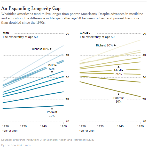
This chart actually has some alarming messages, especially concerning the life expectancy of women with respect to income. If the data is to be believed, the chart suggests that the life expectancy of women that make an income at the 30th percentile or below is actually decreasing for those born between 1920 and 1950. This is a significant trend to investigate further, especially given that the same cannot be said for men of any income bracket (all brackets show some degree of increasing life expectancy over time). Why does this matter to us? Well, on top of its implications to gender earning inequalities that are studied today across many different professional industries, it suggests that a failure to address matters of income inequality could potentially lead to a systematic depression of health quality and life expectancy across the board. That is, as the gap between the wealth and the poor widens, the relative life expectancy of those on the bottom half of the equation could eventually see their life expectancies be at risk of following suit.
One might then ask how inequality is spread across all ages, or rather, is one age group experiencing a larger gap in income than others?
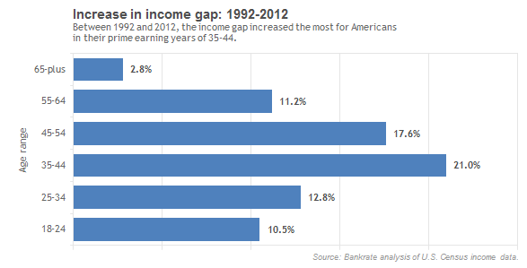
This chart depicts the growth in income gap between the upper and lower income groupings from 1992-2012. That is, adults of age 35-44 have seen the gap between the rich and the poor increase by 21% over the 20-year period. While this age bracket of 35-44 possesses the largest individual percentage of income gap growth, it should be noted that all brackets (other than 65-plus) show fairly significant growth rates over the 20-year period. For the eldest bracket, this may align with intuition being that the vast majority of adults in this bracket cannot (or do not) work a full-time job. Instead, the increase in income gap for this bracket could simply be the result of differences between pension/retirement fund income versus government assistance over that period. Aside from those of "retirement age" in the U.S., this graphic could tell us that the income gap is a significant component for all other age brackets. Choosing to ignore the gap for any individual bracket could continue to have drastic impacts on these figures for the decades to come, as well.
One potential implication of widening inequality amongst all ages that is closely followed is the issue of access. That is, having the means to procure all of the resources necessary to prepare for and go after one's goals. In an article by U.S. News entitled "The Rich and the Rest", Lawrence Katz, the Elisabeth Allison Professor of Economics in Harvard's Faculty of Arts and Sciences, was quoted as saying:
"...what we have been seeing is rising inequality with stagnant mobility, which means that the consequences of where you start out, whether it's in a poor neighborhood, whether it's from a single-parent household, are more consequential today than in the past. Your ZIP code and the exact characteristics of your parents seem to matter more. And that's quite disturbing."
Katz's statement not only highlights the wide reach of these issues, but also highlights the severity of the problem. Is it possible for the gap to get so wide that we create some new breed of a financial caste system, where your point of birth dictates the type of life that you can live? On its face, this notion seems to fly in the face of the very spirit the created this country. How can we evaluate what it takes to live in this country, using a single standard for all citizens? Delving deeper into this line of thinking, let's consider whether or not Americans are making enough money to live, or rather, making a true "living wage".
As a reference, Healthcare.gov (maintained by the U.S. Centers for Medicare & Medicaid Services), reported that the Federal poverty line for a family of three in 2014 stood at a household income of $20,160. This translated to 46.7 million Americans (or 14.8%) being in poverty in 2014. Looking back to our "Mean Household Income" visual above, 14.8% represents almost two-thirds of those represented by the green line (or bottom quintile).
If our aim is to lift as much of those in poverty above the poverty line, what is being done today to achieve this goal?
Do you think that any of this is acceptable? What can we (or should we) be doing to help lessen the poverty level and to reduce the current household income inequality? To more effectively explore these questions, let's take a deeper look into the household costs that are presumed to be necessary to live in America today.
Healthcare.gov lists federal poverty level at $20,160 for a family of 3. In 2014, 14.8% or 46.7 million people were in poverty. Instead of focusing on how much less people near poverty levels make relative to some other group, we want to focus on what it takes to move everyone out of poverty. It is more important to focus on what will lead to everyone earning a living wage. Perhaps the income gap will be reduced, perhaps not.
Defining a Living Wage
Now, let's explore the notion of a "living wage". As one might expect, we define a living wage to be the wage that is necessary for an individual to live in their current place of residence today. A living wage will differ depending upon the location of an individual, as well as their family composition. For example, an individual in Chicago, Illinois will have a different living wage than a married couple with two dependent children living in Boise, Idaho. But what are the components that make a living wage and what does a living wage look like for you? To begin to answer these questions, we will first look at a Living Wage Calculator that was first developed in 2004 by Dr. Amy K. Glasmeier at the Massachusetts Institute of Technology (MIT).
The MIT Living Wage Model
Dr. Glasmeier explained a living wage as follows:
"The living wage model is an alternative measure of basic needs. It is a market-based approach that draws upon geographically specific expenditure data related to a family’s likely minimum food, child care, health insurance, housing, transportation, and other basic necessities (e.g. clothing, personal care items, etc.) costs."
In order to quantify a living wage into a single value, Dr. Glasmeier used two primary formulas:
Basic needs budget = Food cost + child care cost + (insurance premiums + health care costs) + housing cost + transportation cost + other necessities costAND
Living wage = Basic needs budget + (basic needs budget * (taxes))
Further detail concerning the composition of each of the formulaic components above are detailed on the MIT Living Wage Calculator website: Introduction to the living wage model
The MIT Living Wage Calculator
The MIT Living Wage Calculator, which allows for county-level selections, shows a total living wage value for family compositions ranging from a single adult to a married couple with up to three dependent children. To explore this tool, which we highly recommend, the calculator can be found at the following link: Living Wage Calculator
While the MIT model is a wonderful tool with a depth of information for informing users about general cost of living summaries, we felt that there were significant areas for potential improvement on their model, both in terms of the data sources utilized and the method of data presentations. In the next section, we will identify areas for potential enhancement, culminating in an Interactive Living Wage Calculator based on our newly-developed model.
The MIDS Living Wage Model
In considering potential improvements to the MIT Living Wage (LW) model, one primary area of focus was enhancing the depth and quality of the formula components and supporting data. Overall, we find no fault with the underlying model. In fact, we would argue that it gives a realistic, market-based approach toward depicting what it truly costs to live across the United States today. As such, we chose to retain the basic living wage formula developed by MIT and to focus our efforts on expanding the definitions of those components and improving the level of precision possible within the United States. As a result, we were able to significantly improve the level of detail and cost inclusion, which will only serve to further educate users the enriched exploration capabilities.
Consider the following comparison between the MIDS model and MIT model, showing the data sources used and the level of granularity obtained for each cost element:
Model Comparison: Data Sources and Level of Precision |
||||
|---|---|---|---|---|
| MIT Living Wage Model | MIDS Living Wage Model | |||
| Cost Type: | Data Source(s) | Precision | Data Source(s) | Precision |
| Food | USDA's low-cost food plan national average as of June 2014 | Regional* | U.S. Hunger Relief Organization - Feeding America | County-level |
| Child Care | National Association of Child Care Resources and Referral Agencies' estimates as of 2013 | State-level | Compilation of 17 individual state files with extrapolation across remaining states | County-level |
| Medical | Healthcare costs from the 2014 Bureau of Labor Statistics Consumer Expenditure Survey (2013 data); Health insurance cost estimates from Health Insurance Component Analytical Tool (MEPSnet/IC) from the Agency of Healthcare Research and Quality, as of 2013. | Regional*; State-level (respectively) | Healthcare costs: Center for Medicaid/Medicare and Healthcare Marketplace, Health insurance premiums: Affordable Care Act (ACA) | County-level |
| Housing | HUD Fair Market Rents (FMR) estimates**, as of 2014 | County and Sub-County levels | Center for Neighborhood Technology (Housing and Transportation (H+T) Index) | County-level (census tract available, but not modeled) |
| Transportation | National expenditure from the 2014 Bureau of Labor Statistics Consumer Expenditure Survey (2013 data) by household size | Regional* | Center for Neighborhood Technology (Housing and Transportation (H+T) Index) | County-level |
| Other Necessities | National expenditure from the 2014 Bureau of Labor Statistics Consumer Expenditure Survey (2013 data) by household size | Regional* | U.S. Census Bureau consumption data | County-level |
| Taxes | Federal tax: Tax Policy Center of the Urban Institute/Brookings Institution, 2nd lowest bracket*** (2013); State tax: CCH State Tax Handbook (2011); Payroll tax: Federal Insurance Contributions Act (2013) | National; State-level (respectively) | Federal tax; State tax; Additional tax components, including credits (from multiple sources): EITC, FICA/Medicaid, TANF, Section 8, SNAP, Head Start, and Disability | County-level |
**Estimates include general utility expense and vary depending upon the number of bedrooms in each dwelling
***The lowest bracket was used if the second lowest bracket was for incomes over $30,000 annually
Increase Earned Income Tax Credit and Child Tax Credit
Increasing these credits is an effective way to help families in poverty. It also avoids some of the problems with means tested programs.
If you’re interested in looking more deeply in Basic Jobs proposals, we would recommend checking out the following articles:
CBPP Research
Means Tested Daycare
Daycare is one of the largest expenses for young families. It can be more expensive than even housing. It is natural then to propose daycare subsidies. This particular proposal means test the benefit, which creates some unintended problems for two income married couples. At living wage incomes, it penalizes marriage. It also makes it more difficult for families to justify a second income earner. The second income will disqualify them for the daycare benefit just as they need it most.
If you’re interested in looking more deeply in DayCare proposals, we would recommend checking out the following:
Daycare
Expand Safety Net
Safety net programs for housing, daycare, and temporary assistance (TANF) are only able to fund 15%-25% of the eligible people. Expanding the programs to everyone eligible would have a dramatic impact on lowering the living wage but would come with the creation of very high marginal tax rates and a welfare gap.
Bernie Sanders' Medicare for All
Bernie Sanders is proposing extending Medicare to everyone and paying for it with two new taxes.If you’re interested in looking more deeply in Medicare for All, we would recommend checking out the following:
Medicare for AllPurpose of an Interactive Tool
Our ultimate goal with this effort is to allow for deep and spontaneous interaction for our users as they delve into income inequality-related topics. One of the most powerful aspects of any educational process (especially when self-driven) is finding ways to relate the material directly to the daily lives of users. In this context, that means focusing on regions that interests a user, or to focus on a specific LW model or economic policy. To achieve this goal, we've created the Interactive Living Wage Calculator, which allows users to explore living wage compositions for many different economic models, at a county level, across the entire United States!
Using the Interactive Living Wage Explorer
When you first see the tool, you will be looking at a mapping of the MIDS LW model across the United States. The tool uses an ordered color scale of Blue-Tan-Red (shown in the legend, which will be in the bottom-right of the interface) where blue represents the low-value end of the scale, tan represents a midpoint, and red represents the high-value end of the scale. Be sure to review the legend as you select different models or view comparisons of two models. Showing a comparison between models will cause the legend to change in order to show the difference (in USD) between the two models, as opposed to the total living wage value for both models.
In addition to the map, the calculator also includes a bar chart in the bottom-right portion of the interface which populates after both a model and a county are selected by the user. The bar chart will display an itemized listing of the cost components that comprise a county's living wage value. Users can also hover over each bar in the chart to reveal the dollar value of each cost component.
The calculator allows users to select either one or two models at the same time from our list of pre-defined models (discussed above). If one model is selected, the map will reflect the living wage values for each county in the U.S. and the bar chart will populate with the itemized breakdown of costs that make up each county's living wage value. If two models are selected, the calculator will recalculate value and the map will show the difference between the two models selected. The bar chart will also update to allow users to select a breakdown of the differences by item, or to show one of the two model's full breakdown.
As you move your cursor across the map, you'll notice tooltips that provide summary information for each individual county (based on the living wage model selected). When looking at a single model, the tooltips include the name of the county, the annual living wage value for that county, and the percentage of the county's population whose household income is less than the living wage value shown. If you select two models to compare, the tooltips will expand to also include the difference between the two models, as well as the total living wage value for the second model selected.
As a reference, here are a few terms and abbreviations that you might come across while using the Interactive Living Wage Calculator:
- "LW": Refers to "Living Wage"
- "MIT": The original MIT living wage calculator
- "MIDS": The updated living wage calculator
- "CTC": Child Tax Credit
- "EITC": Earned Income Tax Credit
- "% Below LW": The percent of the population earning less than a living wage
- "Diff": Difference between two models or proposals
The MIDS Living Wage Explorer
This tool works best in up-to-date versions of major browsers (Chrome, IE Edge, Firefox, and Safari). Sorry, it is not mobile optimized. Click here to open in a new tab.
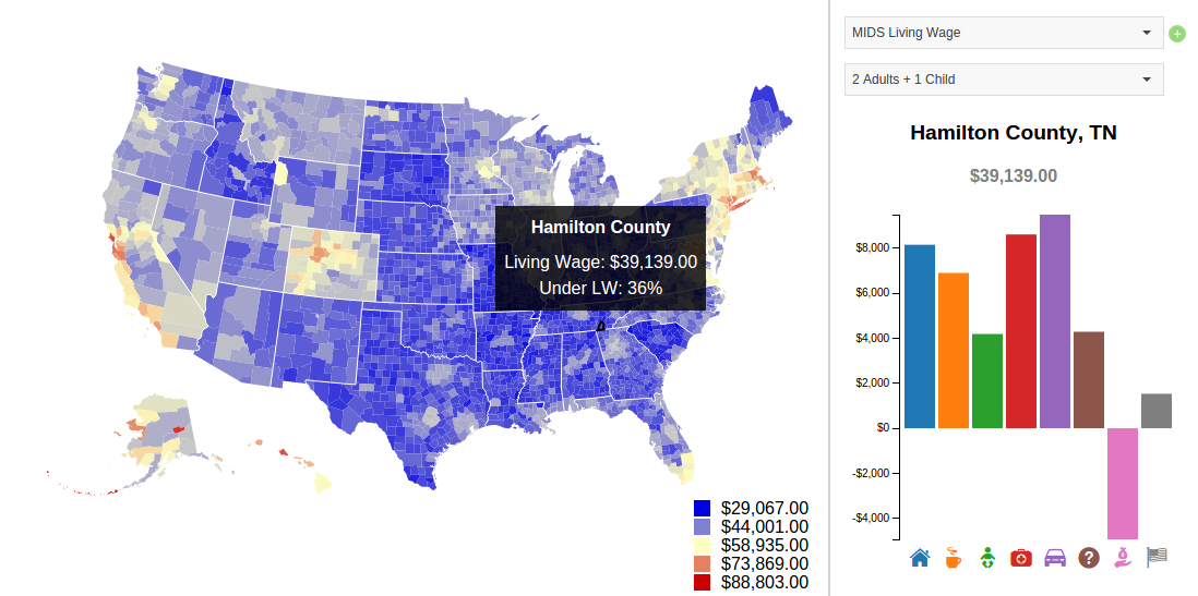 Figure 5: Sample screenshot of our Living Wage exploration tool
Exploring Policy Proposals
One particular set of topics that relate directly to income inequality is the potential for new policies to be implemented, either at the Federal level or at the state level. This is especially true in an election year (as we are in now), which can re-ignite policy debates surrounding income inequality and wealth redistribution. To be clear, we have NO intention of making policy recommendations or engaging in any debate for or against one policy or another. Instead, we believe that it can be incredibly valuable as an educational tool to explore simple models in order to more deeply understand the major components of any economic policy.
To further aid in your exploration of income inequality the policy proposal analysis, we will focus on two common proposals:
1. Universal Basic Income (or “UBI”)
2. Basic Job Guarantees (or “BJG”).
Let’s start by defining these terms and lay some groundwork for further exploration!
What is a Universal Basic Income?
Very simply, UBI is a proposed system that would provide all adults with a standard income nearing the minimum wage in exchange for the removal of Government support programs such as welfare, unemployment, housing assistance, and so forth. There are many variations of a basic income proposal, but this is the essence of UBI, in a nutshell. One possible argument for this model is that current Government assistance programs are inefficiently run and often do not reach a large portion of those who are eligible (either through failures in the process or through a lack of education to the public on eligibility requirements or procedural steps to take advantage of assistance programs). Under UBI, providing a basic income to all adults would place the responsibility of handling basic living expenses back onto citizens and away from Government organizations. Of course, there are many different arguments for and against such a policy, and it is not our intention to engage in any such debates here. Instead, we will use a basic understand of the proposal to estimate a basic cost-benefit model.
If you’re interested in looking more deeply in Universal Basic Income proposals, we would recommend checking out the following articles:
EconoMonitor: "The Economic Case for a Universal Basic Income"Reddit: "BasicIncome"
For our purposes, let’s summarize the elements that we will attempt to include in our UBI model:
- Direct Costs of the program (Eligible adults and program administrators)
- Approximate annual salary of a “basic job”
- Administrative costs to manage the organization and dispersal of funds
- Continuation of support payments to disabled adults who cannot work, but otherwise qualify for the program’s benefit
- Abstract Costs & Benefits (Larger economic or labor force impacts)
- Productivity gains/losses from potential impacts on unemployment (several components)
- Representation of potential changes in job incentives (i.e., does the policy impact the likelihood of someone taking a job rather than staying unemployed?)
What is a Basic Jobs Guarantee?
As the name suggests, a BJG proposal focuses on providing a guarantee of employment for any adults that would otherwise be unemployed. The jobs are normally proposed to be near the minimum wage and involve very basic work that may be otherwise less desirable to an adult with options for employment otherwise. In effect, a BJG would serve as somewhat similar to basic income, but with the added caveat of a requirement to fill a basic job in order to get that income. In doing so, the Government would be able to discontinue unemployment and some welfare assistance programs for individuals that receive a basic job, placing the responsibility for managing day-to-day expenses back onto the worker. This basic policy is very similar to the Civilian Conservation Corp (CCC), which was a work relief program that provided basic jobs to unemployed, unmarried men between 1933 and 1942. For additional information about the CCC program, check out the following link:
Civilian Conservation Corps
If you’re interested in looking more deeply in Basic Jobs proposals and a comparison with UBI, we would recommend checking out the following article:
While the model components for basic jobs are similar to a UBI model, there are some subtle differences.Let’s summarize the elements that we will attempt to include in our BJG model:
- Direct Costs of the program (Eligible workers and program administrators)
- Approximate annual salary of a “basic job”
- Administrative costs to manage the organization and dispersal of funds
- Additional administrative costs to reflect the verification process necessary for registering disabled individuals that will qualify for benefits without working
- Continuation of support payments to disabled adults who cannot work, but otherwise qualify for the program’s benefit
- Abstract Costs & Benefits (Larger economic or labor force impacts)
- Productivity gains from potential impacts on unemployment
- Representation of potential changes in job incentives (i.e., does the policy impact the likelihood of someone taking a job rather than staying unemployed?)
Now that we have a cursory understanding of the thought behind these proposals, one way to continue exploring these notions would be to estimate what the cost-benefit of such policies might look like, if they were ever implemented. For our purposes, we can keep our models simple. Attempting to calculate an incredibly precise outcome would require an equally complex model, which is far more than we need to explore an economic policy at a high level. Instead, we can identify a few key considerations and use those basic notions to quantify potential outcomes over a range of potential impacts that vary based on probabilities that we assign.
Building a Model for Monte Carlo Simulations
One powerful tool for estimating outcomes based on a probabilistic set of variables is Monte Carlo Analysis, and while it may sound overly complicated, we actually only need three components in order to conduct this kind of analysis:
- Basic model components (i.e., inputs and variable components for our model)
- An understanding of how our model’s components interact with one another to quantify an outcome value (ex. if we show costs and benefits, how we might expect those values to impact one another)
- A standard of estimation (i.e., how much variation to allow in each component of our model)
Once these components are defined and placed into a model, Monte Carlo analysis would allow us to run batches of simulations in order to estimate an outcome according to our model definitions.
If you’d like to the mechanics of Monte Carlo Analysis any further, you might consider perusing any of the following article:
"Demystifying Monte Carlo"; Nicol, A., Manufacturing.netLet’s start with exploring potential outcomes for a simple UBI policy. To do so, we can begin by identifying some of the direct costs and benefits of such a program.
First, we can define some details about our environment, which have been listed below with links to the source of each of our data points:
- Number of adults in the U.S. = 245,201,076 adults
- Size of the labor force = 156,090,000 adults
- Number of (registered)) disabled adults = 27,102,850 adults
- Value of a “basic income” = $15,080 (equals minimum wage of $7.25 per hour, over 40 hours per week and 52 weeks in a year)
With these values (which will apply to both the UBI and BJG models), we can move into defining the high-level models for the implementation of UBI or BJG proposals.
Note that two VERY IMPORTANT influences in our choice of model construction and Monte Carlo simulation stemmed from analysis conducted by Chris Stucchio and Jeremy Scheff. Stucchio championed the notion of exploration through modeling, while Scheff offered several potential enhancements or modifications to Stucchio's models. While many reacted to Stucchio's methodology as some sort of biased attempt to favor one policy or another, we chose to appreciate his approach as a method for beginning the conversation, so to speak. That is, creating models and simulating potential outcomes can be an incredibly powerful method for exploring the impacts of economic policies. It's one thing to express a qualitative opinion to policy debates, but it's an entirely different thing to actually attempt to place values alongside your opinions. It is with this motivation that we chose to explore and implement our UBI and BJG models through Monte Carlo simulation.
Given the significance of their methodology to our policy exploration, we would highly recommend taking a look through both Stucchio and Scheff's respective modelling approaches:
"Modelling a Basic Income with Python and Monte Carlo Simulation"; Stucchio, C."Basic income vs. basic jobs"; Scheff, J.
UBI and BJG Model Results
In order to define and execute our model simulations, we chose to use Python as a means for model construction and result output. Using the high-level model attributes and economic statistics detailed above, our model simulations produced the following result: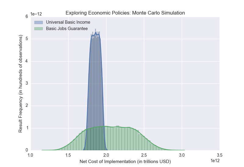
What do these results tell us?
First off, our result is showing us the simulated cost/benefit of implementing each policy proposal. The X axis shows us the cost/benefit in trillions USD, where a positive number represents a residual cost overall and a negative number reflects a residual benefit. The Y axis represents the number of simulations producing a results of each value. Since Monte Carlo simulations allow us to run thousands of simulations (or more), we are especially interested in how the results are distributed. In reviewing our results, we can see that the results for a Basic Jobs Guarantee are much more spread out that those for Basic Income. This tells us that, according to our model and potential unknowns, results from our BJG model possess a much larger variance in outcome, whereas UBI may be more certain in terms of quantifying the monetary impact overall. Their estimated impacts, though, are actually quite similar. We must emphasize, though, that this is a function of our model. If we were to alter any of our parameters or add/remove specific variables, our results may change a great deal.
So, what should you take away from this? The most important takeaway from this analysis is that any policy debate or public consideration can (and should) be aided by attempts to quantify potential impacts. It is crucial to any debate that you understand as much about any potential impacts (good or bad) as possible. Building a model can be incredibly effective in the learning process and often develops an environment that is much more conducive to open debate and intellectual growth.
For further exploration of these policy proposals and others, we highly encourage you to look at our models (as well as Stucchio's and Scheff's) and to consider any potential improvements or enhancements.
Appendix - Supplemental Visualizations and Resources
Interactive Income CurveInteractive Marriage Penalty
More Detailed Living Wage Explorer
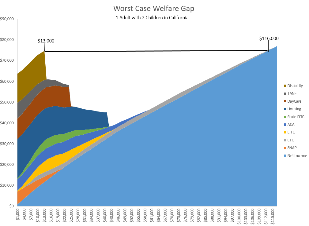
This visualization depicts the potential gap in potential household income from the set of government assistance programs that are available today. Note, though, that it would be unbelievably unusual for a single family to qualify and receive all of these forms of assistance. This chart illustrates what it might look like if every family obtained every assistance benefit for which they were eligible. If they did, theoretically, they would actually be better off making $13,000/year than making $115,000/year.
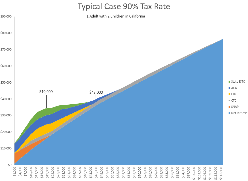
This graph illustrates the marginal tax rates for a single parent of two in California who only receives universally available benefits (SNAP & ACA premium subsidies). Under this example, they would not encounter a welfare gap, but for a crucial stretch of added income, they would face a 90% effective marginal tax rate. Under this model, what would be their incentive to work a second job if their effective tax rate from loss of benefits would eat away at 90% of their added income?
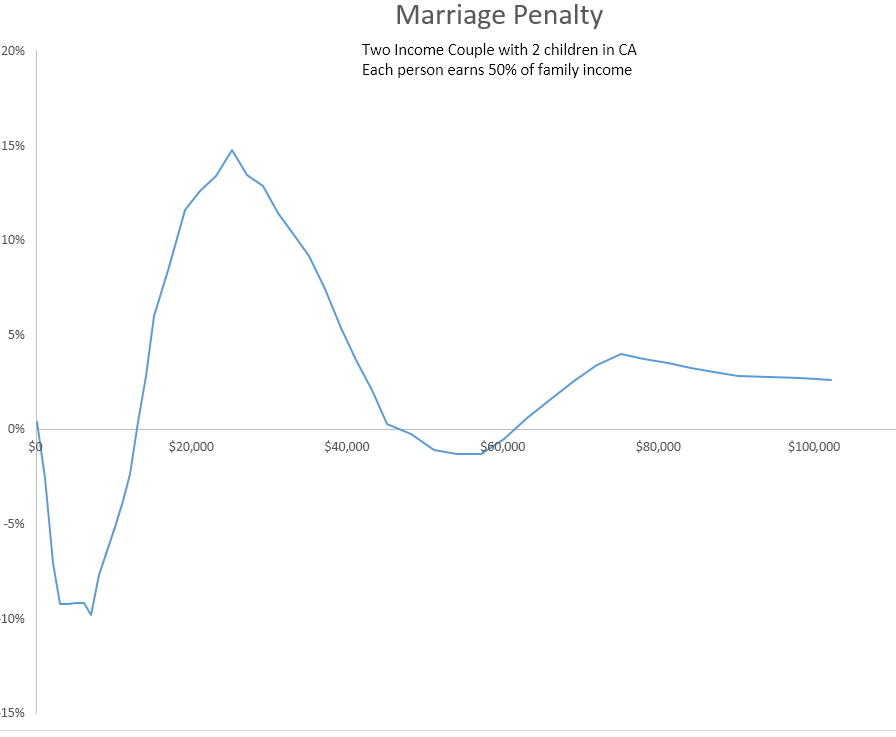
This graph illustrates the potential incentives/disincentives to marriage for the same theoretical family as noted in the previous chart. Under this theoretical construct, they would obtain a varying tax benefit for marrying, but then after a certain point, they experience a loss of these benefits and a theoretical "penalty" for being married, from a financial perspective.
Data Sources
Third Party Libraries and Sources
The interactive Living Wage Explorer makes use of several open source projects, and followed some useful D3 tutorials.
Libraries:- d3, Michael Bostock (@mbostock)
- d3-queue
- topojson
- d3-tip, Justin Palmer (@Caged)
- d3-legend, Susie Lu
- JQuery
- Selectric, Leonardo Santos (@lcdsantos)
- jquery-tabs Jack Moore (@jackmoore)
- D3 Choropleths
- D3 Bar charts
- D3 Map Pan & Zoom
- Map colors inspired by: Color brewer
- Throttled resize events
Under CC: OCHA, Daniel Bruce, Freepik